

在构建网站时,使用 CSS 框架是一个实时的节省,因为它为您提供了每个网页设计师和前端开发人员在制作网站时需要的工具。

CSS 框架是一个软件框架,它允许使用 HTML/CSS 进行更简单、更符合标准的网页设计。许多流行的 CSS 框架都是面向设计的,包含了一些元素,这些元素可以用于创建任何网站或应用程序,以及一个网格系统,旨在为网页提供一个响应性的 CSS 布局。
本文中列出的所有框架都是免费的和开源的。
Bootstrap
Without a doubt, Bootstrap is the most widely used free and open source CSS framework. Created in 2011 by developers Mark Otto and Jacob Thornton, Bootstrap is now used by millions of websites.
Bootstrap features Sass variables and mixins, a responsive grid system, extensive prebuilt components for building layouts, and powerful plugins built on jQuery.
Bootstrap is one of my tools of choice when it comes to building responsive websites or a WordPress theme. It’s extremely easy to learn and the documentation is very complete. If you want tobecome a web developer, learning Bootstrap is a must.
→ Info & download:https://getbootstrap.com/
Pure CSS
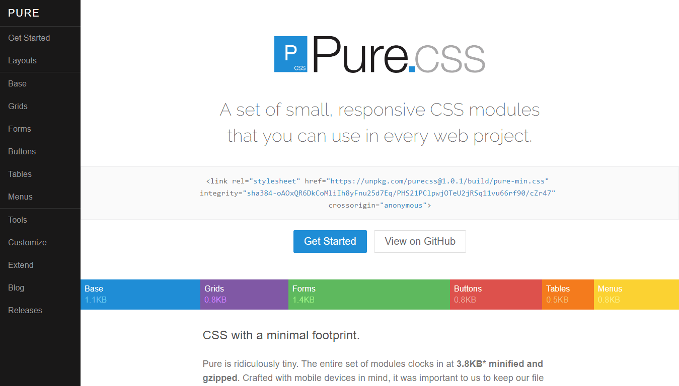
Only 3.8KB minified and gzipped, but packed with tons of features for your web design needs.
Created by Yahoo in 2014, Pure specializes in providing a very lightweight set of responsive CSS layouts and components to act as a foundation for creating a responsive design.
Pure CSS has been my lightweight framework of choice for years now, including when working with anoutsourcing software development team.
→ Info & download:https://purecss.io/
Bulma
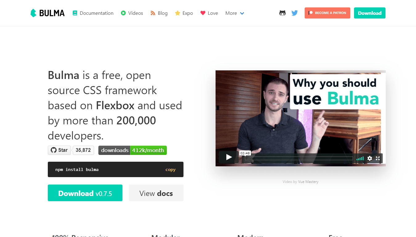
With 21kB minified and gzipped, Bulma isn’t the most lightweight of this list, but this open source CSS framework is so interesting that it totally deserves a mention. Bulma is built with a mobile-first approach, which makes every element optimized for vertical reading, and its grid system is fully built with Flexbox.
Achieving flexible layout with same-size columns is as simple as adding a.columnclass to any of your HTML elements.
Bulma is also built with Sass, which allows you to only use the features you really need in your web development tasks.
→ Info & download:https://bulma.io/
Tailwind
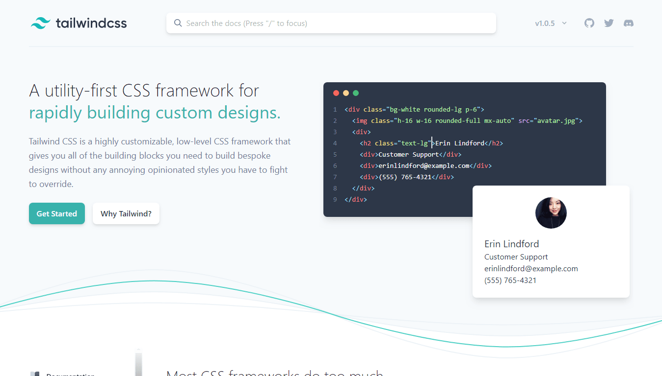
Tailwind is a relatively new CSS framework, designed to be different from its competitors. Instead of predesigned components, Tailwind provides low-level utility classes that let you build your own designs.
Let’s have a quick look to some HTML used with Tailwind:
<button class="bg-blue hover:bg-blue-dark text-white font-bold py-2 px-4 rounded">
  Button
</button>
As you can see, the example is using many utility classes on abuttonelement. Those classes allow you to finely style any element: We can easily spot classes namedtext-white,font-boldandrounded, defining the visual aspect of the button.
→ Info & download:https://tailwindcss.com/
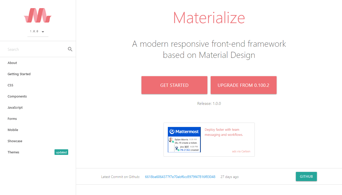
Materialize
Material Design is a design language created in 2014 by Google. It uses more grid-based layouts, responsive animations and transitions, padding, and depth effects such as lighting and shadows.
As of 2019, Material Design has been implemented on most Google products as such as YouTube, Gmail, Google Drive, and Google Docs.
Materialize is a modern responsive front-end framework based on Material Design. Easy to use, it provides components, as well as starter templates which allow you to start designing your website with minimal setup time.
→ Info & download:https://materializecss.com/
Mini.css

Mini is, as the name suggests, a lightweight (7kb gzipped) framework for crafting fast and responsive websites easily.
Standing in the gap between fully-featured frameworks like Bootstrap and very small frameworks as such as Pure.CSS, Mini contains many features (Responsive grid, components…) in a small package.
The framework relies solely on modern CSS, so you do not have to worry about JavaScript conflicts and you can freely decide on which JavaScript library you will use in your project.
→ Info & download:https://minicss.org/
UIkit
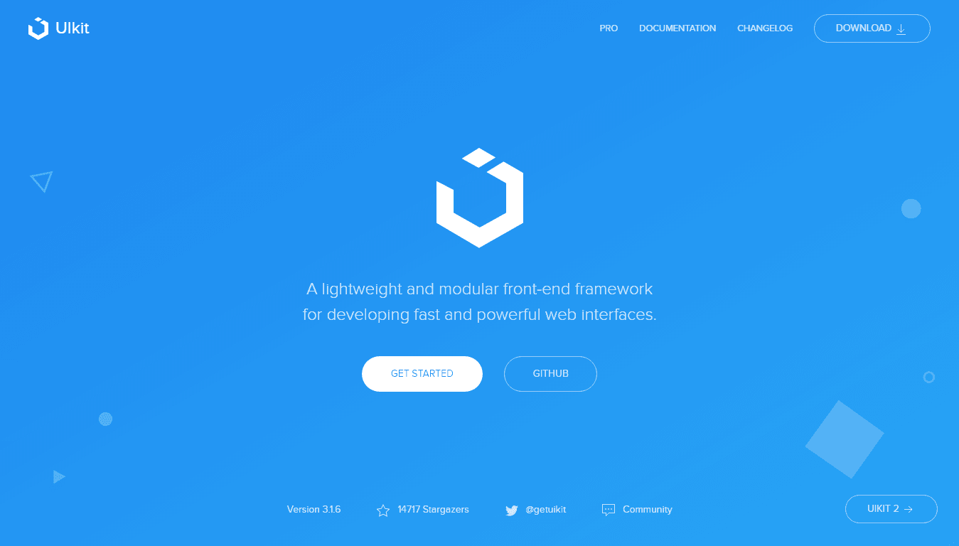
UIkit is a lightweight and responsive CSS framework for developing fast and powerful web interfaces.
Consisting of compiled CSS and JavaScript, UIKit is easy to use and provides all the needed tools for modern web design: Grid, custom icons, components, animations, and a lot more. UIKit is compatible with Less and Sass.
→ Info & download:https://getuikit.com/
Skeleton
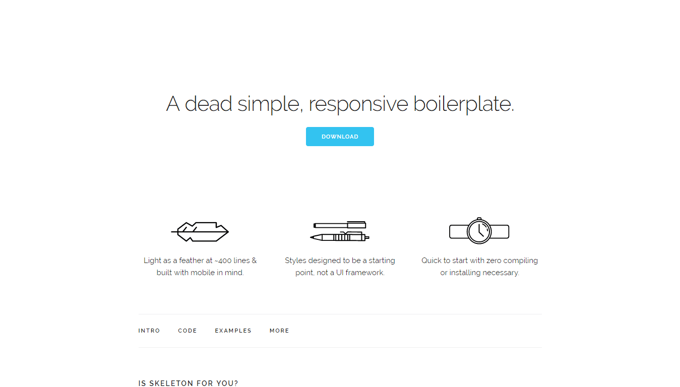
With only 400 lines of code, Skeleton is light as a feather. Yet, it features a responsive CSS grid system, typography, forms, media queries… all you need for building a quality site in no time.
Designed as a starting point for your projects, Skeleton only includes styles a handful of HTML elements and provides a simple but efficient grid system. As no compiling or installing is required, this lightweight framework makes it easy to create any type of responsive design.
→ Info & download:http://getskeleton.com/
Base
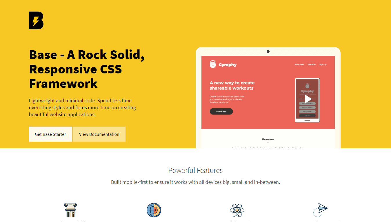
Base is a very simple but robust responsive framework. Built with lightweight and minimal code, Base is designed to provide developers and designers an easy way to built cross-browser, mobile-first websites and web applications.
This very handy framework will provide a solid foundation for creating quality responsive designs in no time.
→ Info & download:http://getbase.org/
Spectre
A lightweight (~10KB gzipped) starting point for your projects, Spectre provides elegantly designed elements, as well as a flexbox-based, responsive and mobile-friendly layout.
Much smaller in size and features than fully-featured frameworks like Bootstrap, Spectre is a great choice for single-page websites and small web applications.
→ Info & download:https://picturepan2.github.io/spectre/
Milligram
Milligram provides a minimal setup of styles for a fast and clean starting point. With only 2kb gzipped, this tiny but powerful framework is in the top three of the lightweight framework available.
Despite its very small size, Milligram provides a complete set of web development tools and fully exploits the possibilities offered by the CSS3 specification.
→ Info & download:https://milligram.github.io/
Dead Simple Grid
Dead Simple Grid isn’t really a framework. As the name suggests, this tool only consists of a simple grid layout that can be used in every project.
With only 250 bytes of CSS code, Dead Simple Grid will be useful to web developers in need of a grid system, without the components usually provided by a more complete framework.
→ Info & download:https://github.com/mourner/dead-simple-grid
Picnic CSS
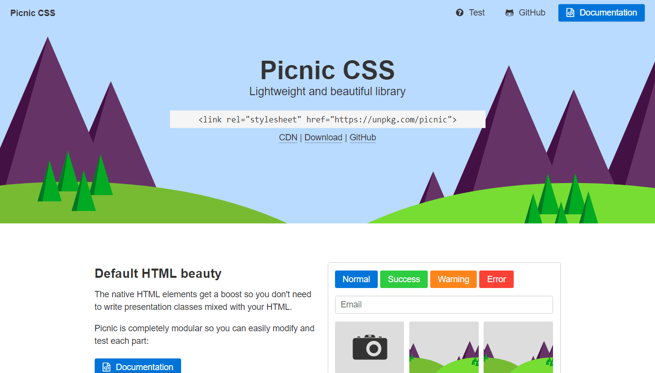
With a size of less than 10kb when gzipped, Picnic is for sure lightweight, but also has everything you need for creating a great looking, functional website.
Using Picnic is super easy, as you can simply embed the stylesheet by adding the following line in the<head>section of your page:
<link rel="stylesheet" href="https://unpkg.com/picnic">
Tiny but very complete, the framework features all the needed components for crafting modern websites: Grid, forms, tabs, tooltips, alerts…
Picnic is written in Sass/SCSS with many variables and classes to make it easy to extend.
→ Info & download:https://picnicss.com/
本站文章大部分始于原创,用于个人学习记录,可能对您有所帮助,仅供参考!


俄罗斯莫斯科 1F
222不错
陕西省西安市 2F
这次更新的主题有bug,密码重置是无限循环,没法重设密码
浙江省宁波市 B1
@ 枫行者 已解决,这个bug是wp里的,不是主题里的,,